Why Real-Time Dashboards Matter in Incident Management Software
Sep. 23rd, 2026 12:00 pm
An incident moves fast. Information about that incident usually moves slower. That gap is where costly decisions get made. A real-time incident dashboard exists to close that gap, giving everyone in the response the same picture at the same moment.
When a windstorm knocks out power across three counties, or a crowd surge starts at a stadium gate, leaders cannot wait for a situation report to be typed up and emailed. They need to see what is happening now. Dashboards have quietly become one of the most important features in incident management software, and it is worth understanding why.
Real-Time Incident Dashboard: The Cost of Delayed Information During an Incident
Most incident response delays are not caused by a lack of effort. They are caused by a lack of visibility.
Picture a county activation in its first hour. Radio traffic is heavy. Three agencies are calling in resource needs. Someone is maintaining a spreadsheet. Someone else is tracking shelters on a whiteboard. None of those sources agree with each other.
The results are predictable. Two agencies order the same generator. A shelter reaches capacity before anyone updates the intake list. An executive asks a simple question and waits twenty minutes for an answer.
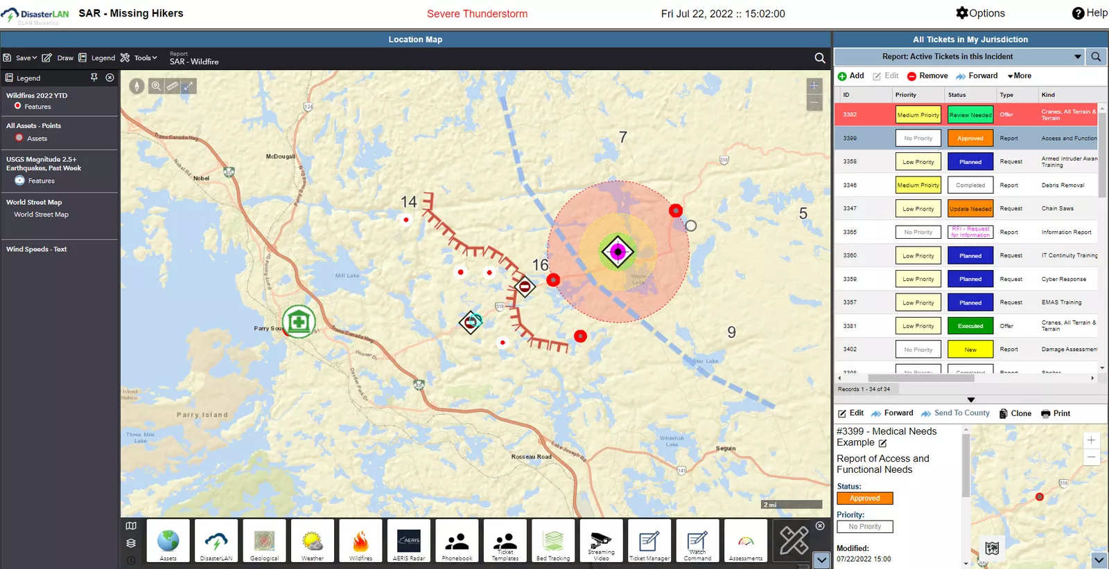
Modern incident management software solves this differently. Instead of pushing information upward through layers, it publishes information outward to everyone at once. The dashboard becomes the single reference point. When a resource request status changes, the change is visible immediately, not at the next briefing.
What a Real-Time Incident Dashboard Actually Shows
Not every dashboard is useful. Some are just decorative charts. A dashboard built for response work has to answer the questions that command staff actually ask.
Here is what belongs on a strong operational view:
-
Active incidents and their current status, so nothing sits unassigned or unnoticed
-
Resource requests and their fulfillment stage, from submitted to en route to demobilized
-
Task assignments by agency or section, showing who owns what right now
-
Shelter, facility, and asset status, updated from the field rather than from memory
-
Geospatial context through mapping, so location data is visual instead of textual
-
Open action items and unresolved requests, which are often the real risk points
These are the core capabilities that separate a working operational picture from a static status board. The value is not in the volume of data. The value is in showing the right handful of things without anyone having to dig for them.
Bringing Unfamiliar Agencies onto the Same Page
Here is a challenge that rarely gets discussed openly. Major incidents force unfamiliar people into unfamiliar roles at unfamiliar venues, often within minutes.
A mutual aid partner arrives from two counties over. A campus emergency manager stands up an operation with volunteers who have never worked together. A utility deploys crews into a jurisdiction they have not served before. Everyone is competent. Almost nobody shares context.
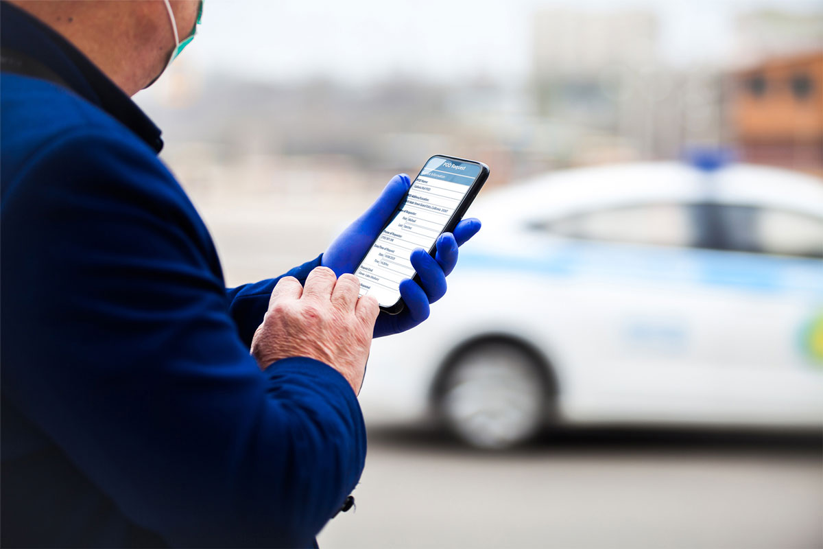
A shared dashboard becomes the fastest way to create that context. New arrivals do not need a long verbal briefing. They open the screen and see the operation as it stands.
This matters enormously in a few settings:
-
Higher education and game day operations, where police, fire, EMS, athletics, and facilities converge for a few high-pressure hours
-
Utilities and energy providers, where restoration crews coordinate with county emergency operations across wide service territories
-
Regional and state activations, where dozens of agencies plug into a structure that changes hour by hour
Interoperability is often framed as a technical problem. In practice, it is also a human one. A common view reduces the amount of translation people have to do in their heads.
Turning Dashboard Data into Decisions Leaders Trust
Real-time visibility only helps if the data behind it is trustworthy. That trust depends on integration.
Weather feeds, alerting systems, GIS layers, CAD data, and internal databases all hold pieces of the picture. When those systems stay separate, staff spend the activation copying information between them. That work is slow, and it introduces errors at the worst possible time.
Buffalo Computer Graphics built the DLAN Incident Management System around this exact problem. DLAN was developed in cooperation with emergency managers in Erie County, New York, and remains the only IMS designed by emergency managers for emergency managers from the ground up. Every capability, from planning and assessments to duty officer workflows and executive oversight, came from one in-house engineering team with a unified design philosophy. There is no patchwork of acquired tools stitched together after the fact.
That matters for dashboards specifically. When the underlying system is cohesive, the dashboard reflects the entire operation rather than one slice of it. Our team also supports GIS work, API integrations, and interoperability services, so your dashboard pulls from the systems your organization already relies on. ICS-trained, FEMA-certified personnel are available for activation support, exercises, and plan development as well.
See What Your Next Activation Could Look Like
Think about your last activation for a moment. How long did it take to answer a simple question from your executive team? How many people were maintaining their own version of the truth?
If those answers make you uncomfortable, you are not alone. Most organizations discover their information gaps under pressure rather than in planning. The good news is that this is a solvable problem, and you do not have to rebuild your entire program to fix it.
We would genuinely enjoy showing you what a unified operating picture looks like with your own scenarios in mind. Request a demo and see your next incident on one screen.

